Foundation
The core of the design system
The core of the design system
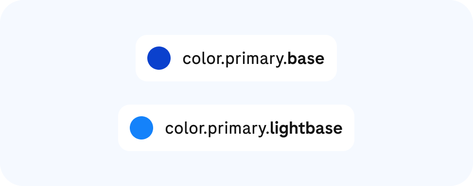
Explore the fundamental decisions that shape every Roche experience—tokens, color, typography, spacing, motion, and more.
Explore the fundamental decisions that shape every Roche experience—tokens, color, typography, spacing, motion, and more.